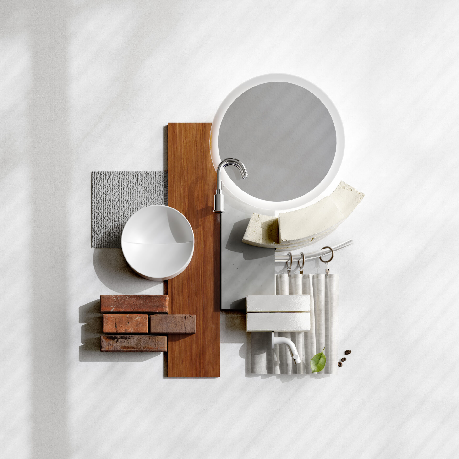
Glazed brick is making a comeback. Glazed bricks were a mainstay of Art Nouveau design at the beginning of the twentieth century, and regained their popularity in the 1960s. Today, the popularity of this brick and its almost associated interior design style is being revived again. A look at this house shows exactly how this old style fits into our modern times. Who said vintage was out of fashion?
Glazed brick is making a comeback. Glazed bricks were a mainstay of Art Nouveau design at the beginning of the twentieth century, and regained their popularity in the 1960s. Today, the popularity of this brick and its almost associated interior design style is being revived again. A look at this house shows exactly how this old style fits into our modern times. Who said vintage was out of fashion?
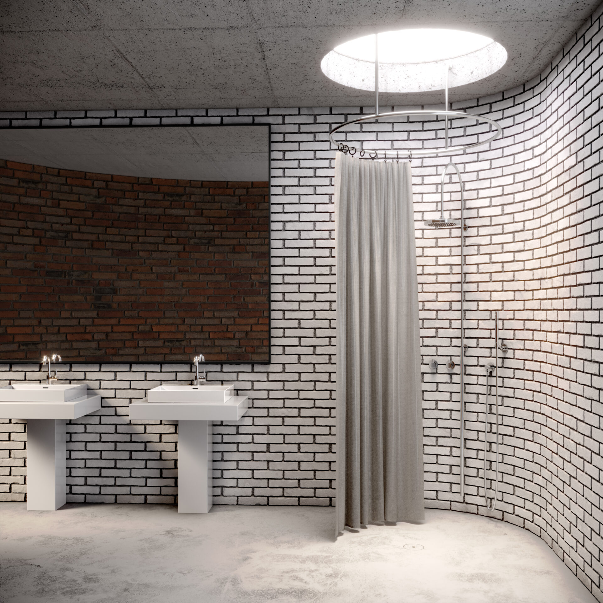
The owners of this house are no strangers to the colour white, as can be seen in their confident usage of different shades and materials. The silky smooth surfaces of the New Wash Me washbasins fit perfectly with the custom-made columns they rest on. With these columns, the residents add another old-school touch to the room.
The owners of this house are no strangers to the colour white, as can be seen in their confident usage of different shades and materials. The silky smooth surfaces of the New Wash Me washbasins fit perfectly with the custom-made columns they rest on. With these columns, the residents add another old-school touch to the room.
A backdrop of glazed brick with dark grout is a beautiful addition to the light grey concrete floor and matching shower curtain and bright white light coming from the skylight above it.
A backdrop of glazed brick with dark grout is a beautiful addition to the light grey concrete floor and matching shower curtain and bright white light coming from the skylight above it.
View New Wash Me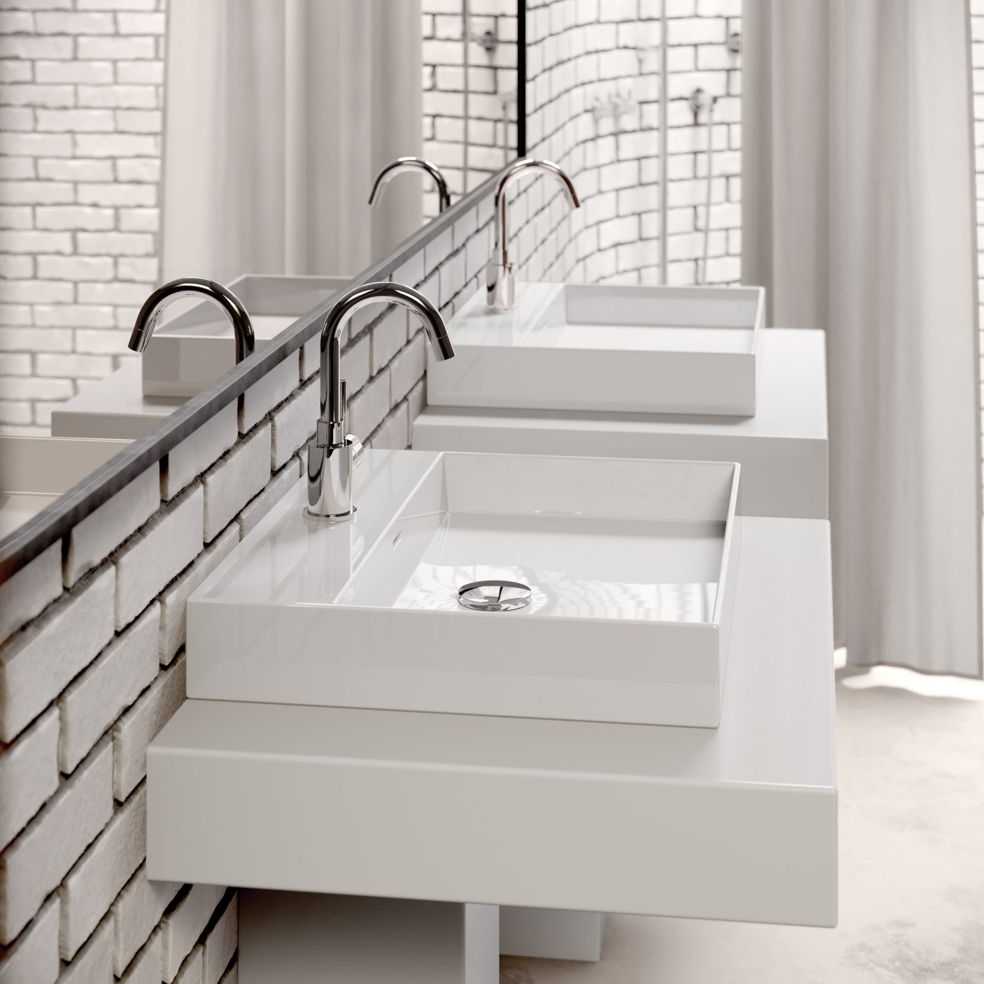
A little closer, we can see even more how well the different shades of white match and complement each other. In addition, from this close the wafer-thin walls of the New Wash Me wash basins stand out even more. The straight, white shapes of this extra-thin Wash Me variant are a nice contrast to the round, chrome tap and drain. The residents also used these round shapes and chrome in the shower, in both the tap and the curtain suspension.
A little closer, we can see even more how well the different shades of white match and complement each other. In addition, from this close the wafer-thin walls of the New Wash Me wash basins stand out even more. The straight, white shapes of this extra-thin Wash Me variant are a nice contrast to the round, chrome tap and drain. The residents also used these round shapes and chrome in the shower, in both the tap and the curtain suspension.
View Xo wash basin mixer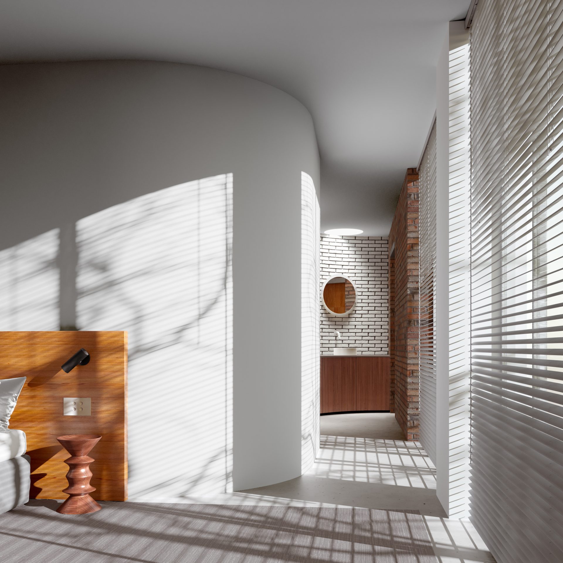
When decorating the bedroom, the residents took into account the adjoining bathroom. They have chosen a mahogany-like wood for the furniture in both rooms. The sunlight falling on the head of the bed brings out the orange undertone of the wood. The warm hue of the wood can also be found in the high, un-glazed brick wall in the bathroom.
When decorating the bedroom, the residents took into account the adjoining bathroom. They have chosen a mahogany-like wood for the furniture in both rooms. The sunlight falling on the head of the bed brings out the orange undertone of the wood. The warm hue of the wood can also be found in the high, un-glazed brick wall in the bathroom.
The symmetrically shaped bedside table designed by Ray and Charles Eames and black night-light also fit in well with the colour scheme of the bathroom.
The symmetrically shaped bedside table designed by Ray and Charles Eames and black night-light also fit in well with the colour scheme of the bathroom.
View Herman Miller stool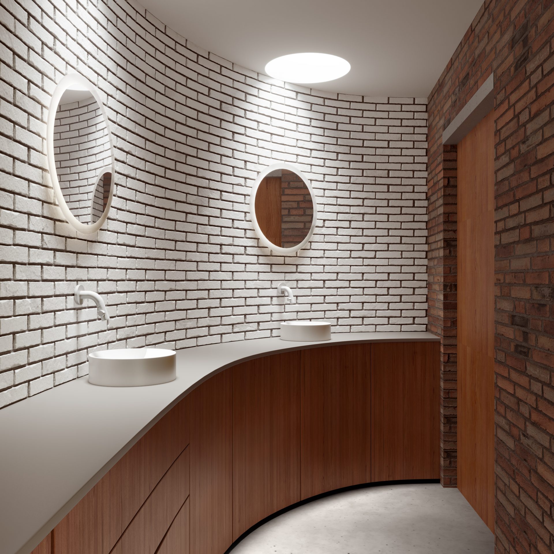
Matt white seems to dominate, but wood and brown-red brick also play a big part in this space. The 60's are also well reflected in this bathroom. Besides the glazed brick, the rounded shapes in this room also remind us of the sixties. The owners have made good use of this and accentuated the curved walls with round handbasins and mirrors.
Matt white seems to dominate, but wood and brown-red brick also play a big part in this space. The 60's are also well reflected in this bathroom. Besides the glazed brick, the rounded shapes in this room also remind us of the sixties. The owners have made good use of this and accentuated the curved walls with round handbasins and mirrors.
The large, round Look at Me mirror illuminated from behind and the small Vale handbasin therefore fit the interior theme in terms of both their shape and their colour. An old style with modern materials.
The large, round Look at Me mirror illuminated from behind and the small Vale handbasin therefore fit the interior theme in terms of both their shape and their colour. An old style with modern materials.
View Look at Me mirror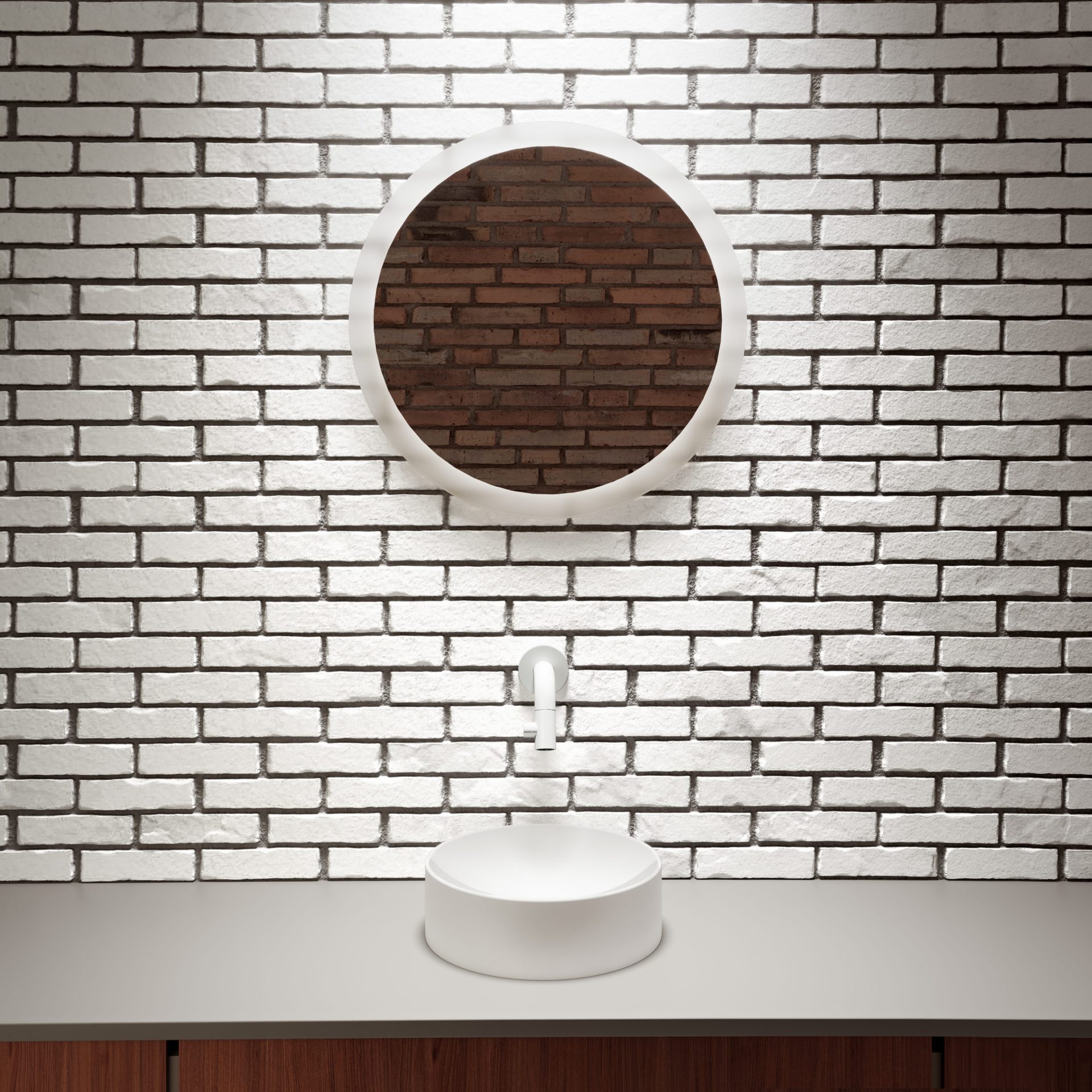
'Round' was the central theme when the residents started designing their bathroom. Thus mirror, handbasin and tap fit well in the space and in combination with each other. They all have different sizes, but they are all round, all matt white and all matching. By the way, brown-red is never really out of sight. Take a look in the mirror.
'Round' was the central theme when the residents started designing their bathroom. Thus mirror, handbasin and tap fit well in the space and in combination with each other. They all have different sizes, but they are all round, all matt white and all matching. By the way, brown-red is never really out of sight. Take a look in the mirror.
Between the mirror and the handbasin, the minimalist Kaldur tap has a grand appearance thanks to its rounded design. It is a small eye-catcher that blends seamlessly with the vintage theme of the room, but is also sleek enough for a completely modern interior.
Between the mirror and the handbasin, the minimalist Kaldur tap has a grand appearance thanks to its rounded design. It is a small eye-catcher that blends seamlessly with the vintage theme of the room, but is also sleek enough for a completely modern interior.
View Kaldur in matt white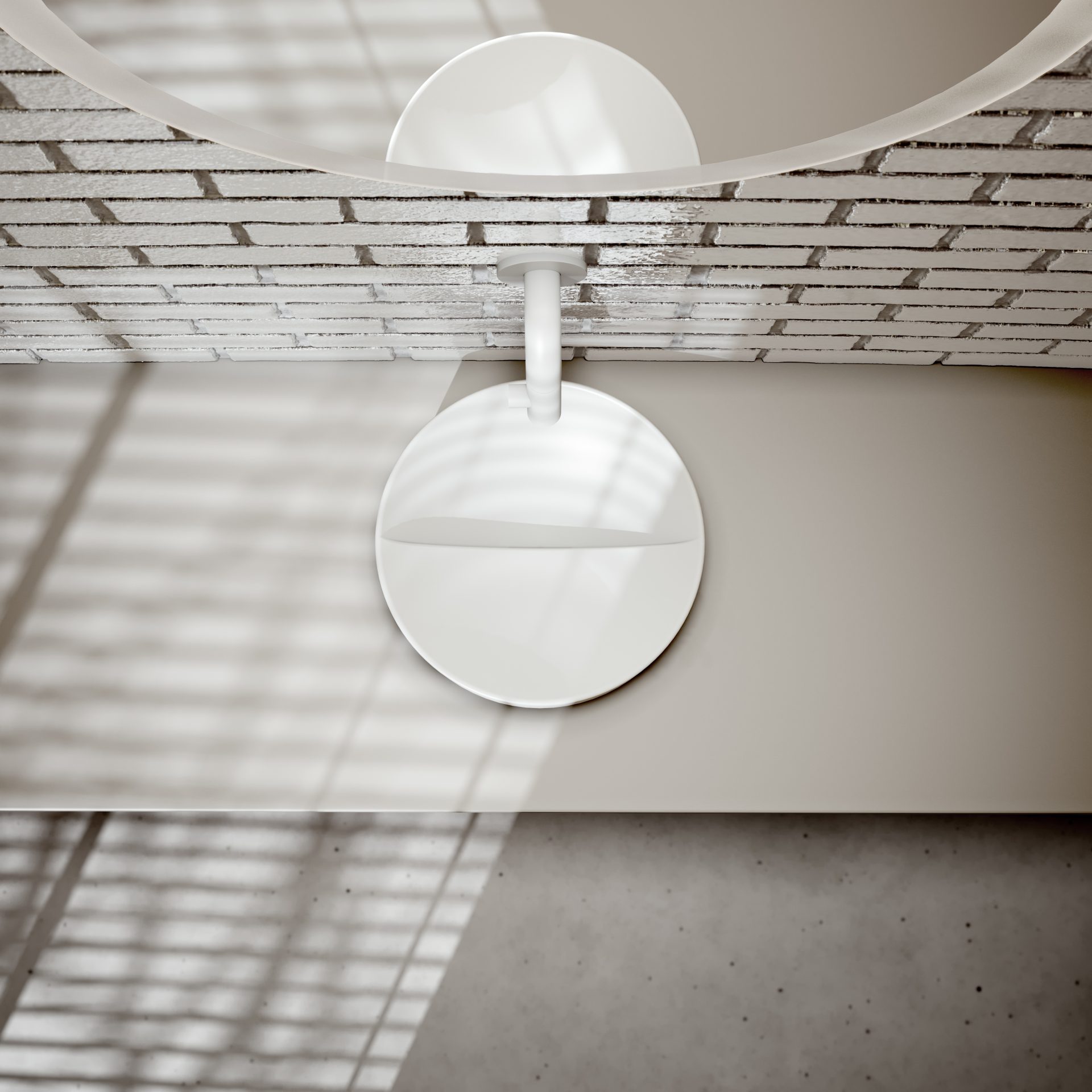
The round Vale handbasin, like the tap above it, is on the small side. But that does not make this piece of design any less striking. The upper surface consists of two levels, creating an invisible drain at the breakwater. All the water flows away, just like in a valley, to the lowest point. The residents fell for the sweet, unusual look of this white handbasin and found a perfect spot for it in this space where modern meets retro.
The round Vale handbasin, like the tap above it, is on the small side. But that does not make this piece of design any less striking. The upper surface consists of two levels, creating an invisible drain at the breakwater. All the water flows away, just like in a valley, to the lowest point. The residents fell for the sweet, unusual look of this white handbasin and found a perfect spot for it in this space where modern meets retro.
View round Vale handbasinsOur products are available both online and offline. Find out which location is closest to you or which online option works best for you via the "points of sale" button.