The basis of this interior is not a colour or a material, it is a period of time. This old warehouse now serves as a residence, but traces of its former function are still visible. Take a look inside, and discover how the residents have even highlighted some of the old elements of the building in their modern interior.
The basis of this interior is not a colour or a material, it is a period of time. This old warehouse now serves as a residence, but traces of its former function are still visible. Take a look inside, and discover how the residents have even highlighted some of the old elements of the building in their modern interior.
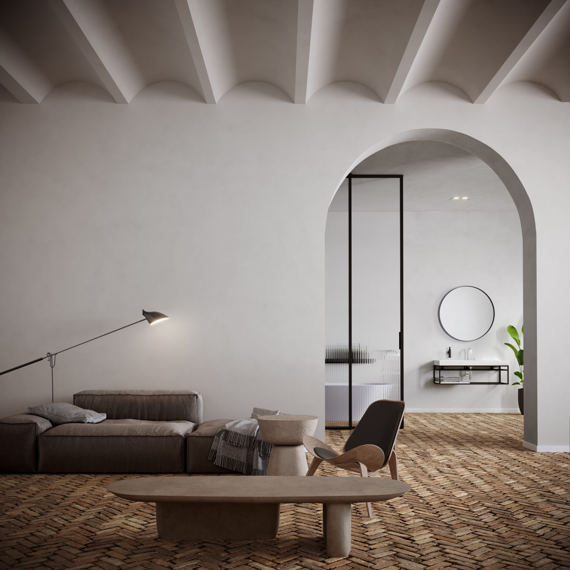
This room is full of eye-catchers. Who does not notice the vaulted ceiling at first, will look at the old stone floor. Another is immediately in awe of the curved passageway to the bathroom. With all these impressions, it is not surprising that the residents have chosen mainly low, brown-tinted furniture that does not steal attention away from what is going on around them.
This room is full of eye-catchers. Who does not notice the vaulted ceiling at first, will look at the old stone floor. Another is immediately in awe of the curved passageway to the bathroom. With all these impressions, it is not surprising that the residents have chosen mainly low, brown-tinted furniture that does not steal attention away from what is going on around them.
The Carl Hansen & Søn CH07 Shell Chair by Hans J. Wegner, for example, is a work of art in itself. In this interior, however, the chair is part of the whole.
The Carl Hansen & Søn CH07 Shell Chair by Hans J. Wegner, for example, is a work of art in itself. In this interior, however, the chair is part of the whole.
View Carl Hansen & Søn CH07 Shell chair by Hans J. WegnerThe same goes for the David Weeks Studio Loop & Hook No. 308 floor lamp, which really is part of this small seating area.
The same goes for the David Weeks Studio Loop & Hook No. 308 floor lamp, which really is part of this small seating area.
View David Weeks Studio lampsThe Extrasoft sofa designed by Piero Lissoni also has its own place in the whole. The playful, rounded shapes of the furniture make for a lively whole that contrasts sharply with the straight, white and black furniture in the adjacent bathroom. This way, despite the largely open passageway, the residents have created two completely different spaces.
The Extrasoft sofa designed by Piero Lissoni also has its own place in the whole. The playful, rounded shapes of the furniture make for a lively whole that contrasts sharply with the straight, white and black furniture in the adjacent bathroom. This way, despite the largely open passageway, the residents have created two completely different spaces.
View Living Divani Extrasoft by Piero Lissoni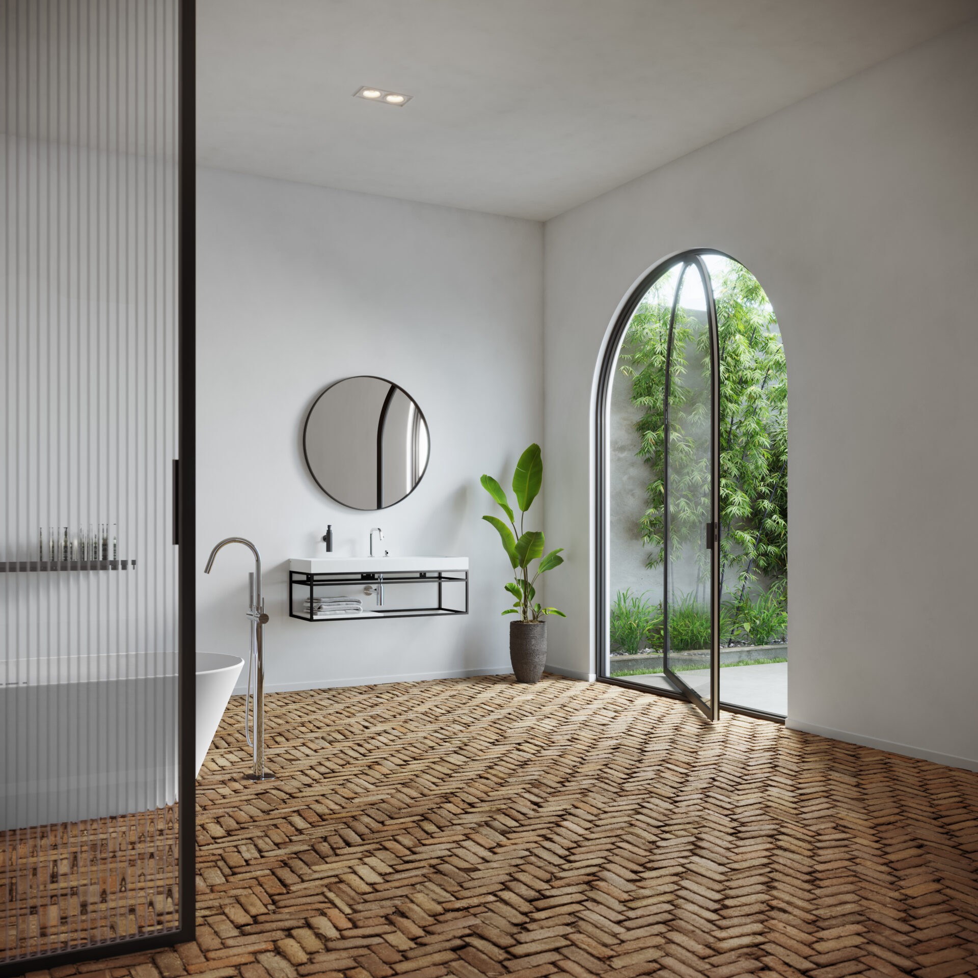
Curved portals are not very common and therefore stand out even more. The residents have used the original structure of the building for both the garden door and the passage from the living room to the bathroom.
Curved portals are not very common and therefore stand out even more. The residents have used the original structure of the building for both the garden door and the passage from the living room to the bathroom.
However, where previously wooden gates closed off the space, there is now a custom-made glass pivoting door that allows the residents to look directly from the bath into the garden. The thin, black frame of the door blends seamlessly with the design of Glas Italia's Aladin sliding door, which provides some privacy in the bathroom.
However, where previously wooden gates closed off the space, there is now a custom-made glass pivoting door that allows the residents to look directly from the bath into the garden. The thin, black frame of the door blends seamlessly with the design of Glas Italia's Aladin sliding door, which provides some privacy in the bathroom.
View GLAS ITALIA Aladin sliding door by Piero Lissoni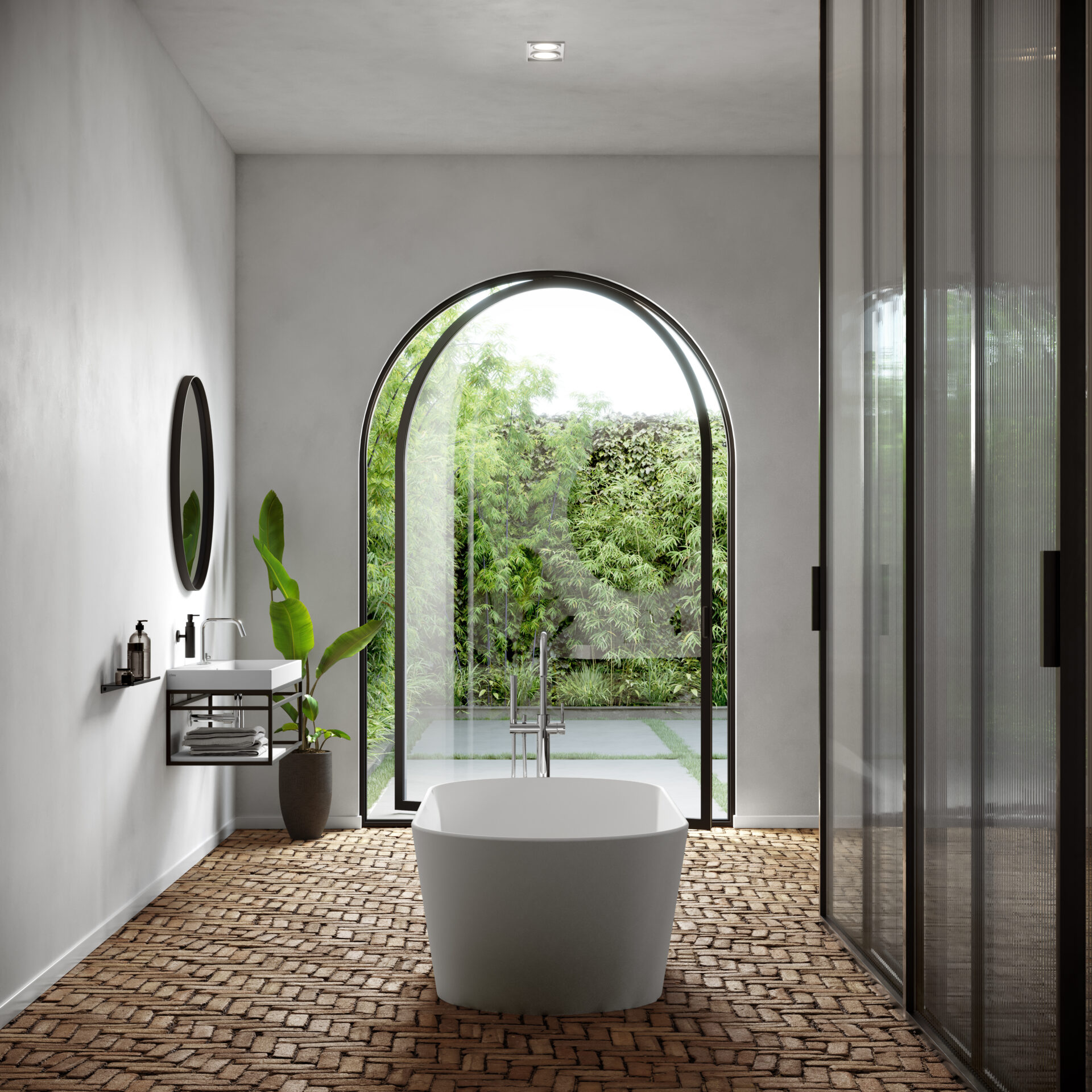
In the bathroom, too, the residents made conscious choices to create a matching whole with different pieces of furniture. The Clou Frame open cabinet, Ocio mirror by Lineabeta and the Fold wall shelf fit well with the modern doors. Thanks to their narrow black edges the furniture form a sleek whole, despite their different shapes.
In the bathroom, too, the residents made conscious choices to create a matching whole with different pieces of furniture. The Clou Frame open cabinet, Ocio mirror by Lineabeta and the Fold wall shelf fit well with the modern doors. Thanks to their narrow black edges the furniture form a sleek whole, despite their different shapes.
View Frame open cabinetThe washbasin, bathtub and inlay shelf in matt white aluite match the clean walls perfectly. The Solium bathtub, with its both straight and rounded corners, seems almost made for the large semi-circular door to the garden. These two eye-catchers form the centrepiece between round and straight, and are also literally the centre of the room.
The washbasin, bathtub and inlay shelf in matt white aluite match the clean walls perfectly. The Solium bathtub, with its both straight and rounded corners, seems almost made for the large semi-circular door to the garden. These two eye-catchers form the centrepiece between round and straight, and are also literally the centre of the room.
View Solium bathDe chromen badmengkraan, wastafelmengkraan en sifon vallen door hun kleur minder op dan de zwarte accenten in de badkamer. The chrome bathtub mixer, washbasin mixer and siphon are less conspicuous than the black accents in the bathroom due to their colour.
De chromen badmengkraan, wastafelmengkraan en sifon vallen door hun kleur minder op dan de zwarte accenten in de badkamer. The chrome bathtub mixer, washbasin mixer and siphon are less conspicuous than the black accents in the bathroom due to their colour.
View Kaldur washbasin mixerA deliberate choice on the part of the owners, who, by opting for chrome, sought a middle course between colour and black.
A deliberate choice on the part of the owners, who, by opting for chrome, sought a middle course between colour and black.
View Xo bathtub mixer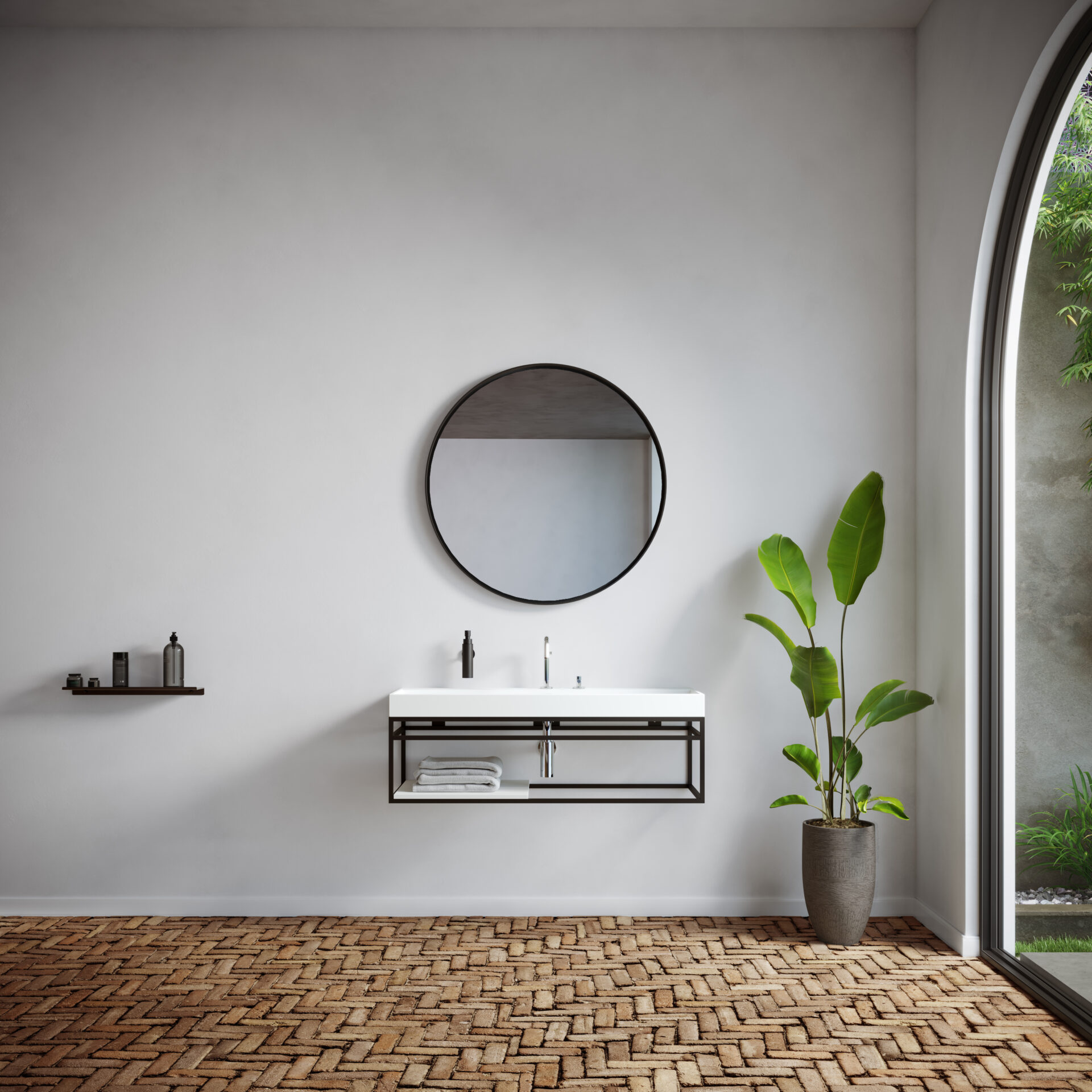
Thanks to the fairly simple colour scheme of white and black, the warmly tinted floor stands out here, just like in the living room. The green of the houseplant and the bushes and grass outside make a nice change from the basic colours of the interior. The Frame open cabinet and the round Ocio mirror by Lineabeta above it, reflect the shape of the garden door: round at the top, straight at the bottom.
Thanks to the fairly simple colour scheme of white and black, the warmly tinted floor stands out here, just like in the living room. The green of the houseplant and the bushes and grass outside make a nice change from the basic colours of the interior. The Frame open cabinet and the round Ocio mirror by Lineabeta above it, reflect the shape of the garden door: round at the top, straight at the bottom.
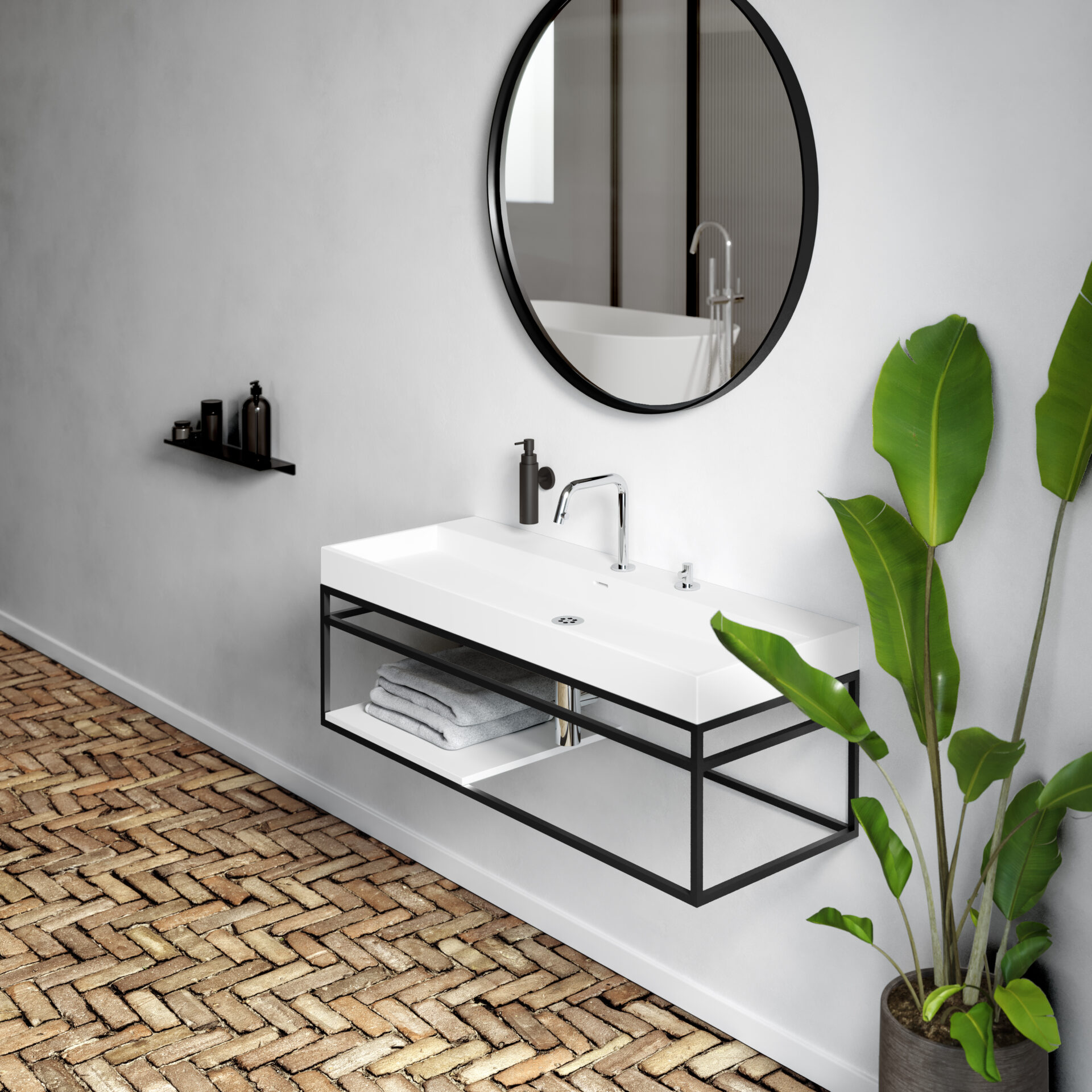
The accessories are fully adapted to the interior. No brightly coloured bottles, but everything beautifully uniform in black. The light towels emphasise the open character of the Frame cabinet. They also go well with the chrome Kaldur mixer.
The accessories are fully adapted to the interior. No brightly coloured bottles, but everything beautifully uniform in black. The light towels emphasise the open character of the Frame cabinet. They also go well with the chrome Kaldur mixer.
View Sjokker soap dispenser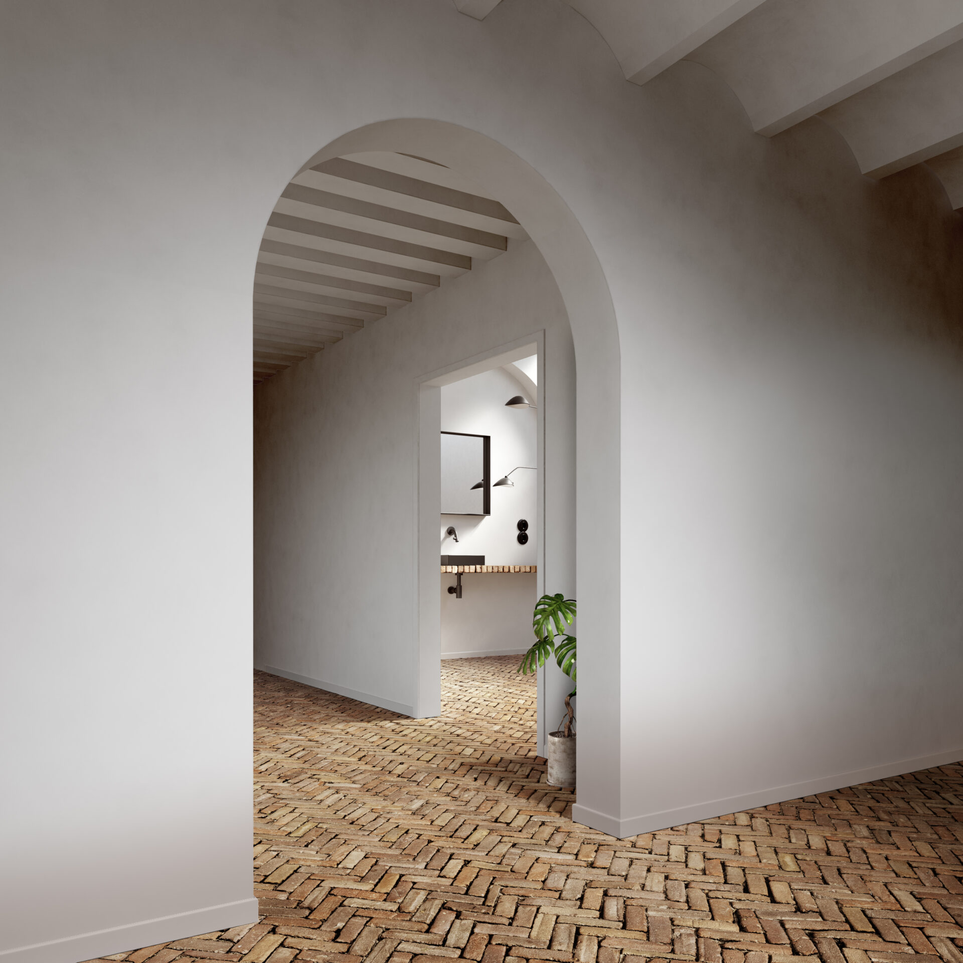
Walking towards the guest toilet, the open structure of this house is clearly visible too. Here, the unconventional ceiling again catches the eye. Vaulted on one side of the curved passageway, with an unadorned version of a so-called 'Kölner Decke', or plastered beam ceiling, on the other. A Swiss cheese plant provides some extra colour here.
Walking towards the guest toilet, the open structure of this house is clearly visible too. Here, the unconventional ceiling again catches the eye. Vaulted on one side of the curved passageway, with an unadorned version of a so-called 'Kölner Decke', or plastered beam ceiling, on the other. A Swiss cheese plant provides some extra colour here.
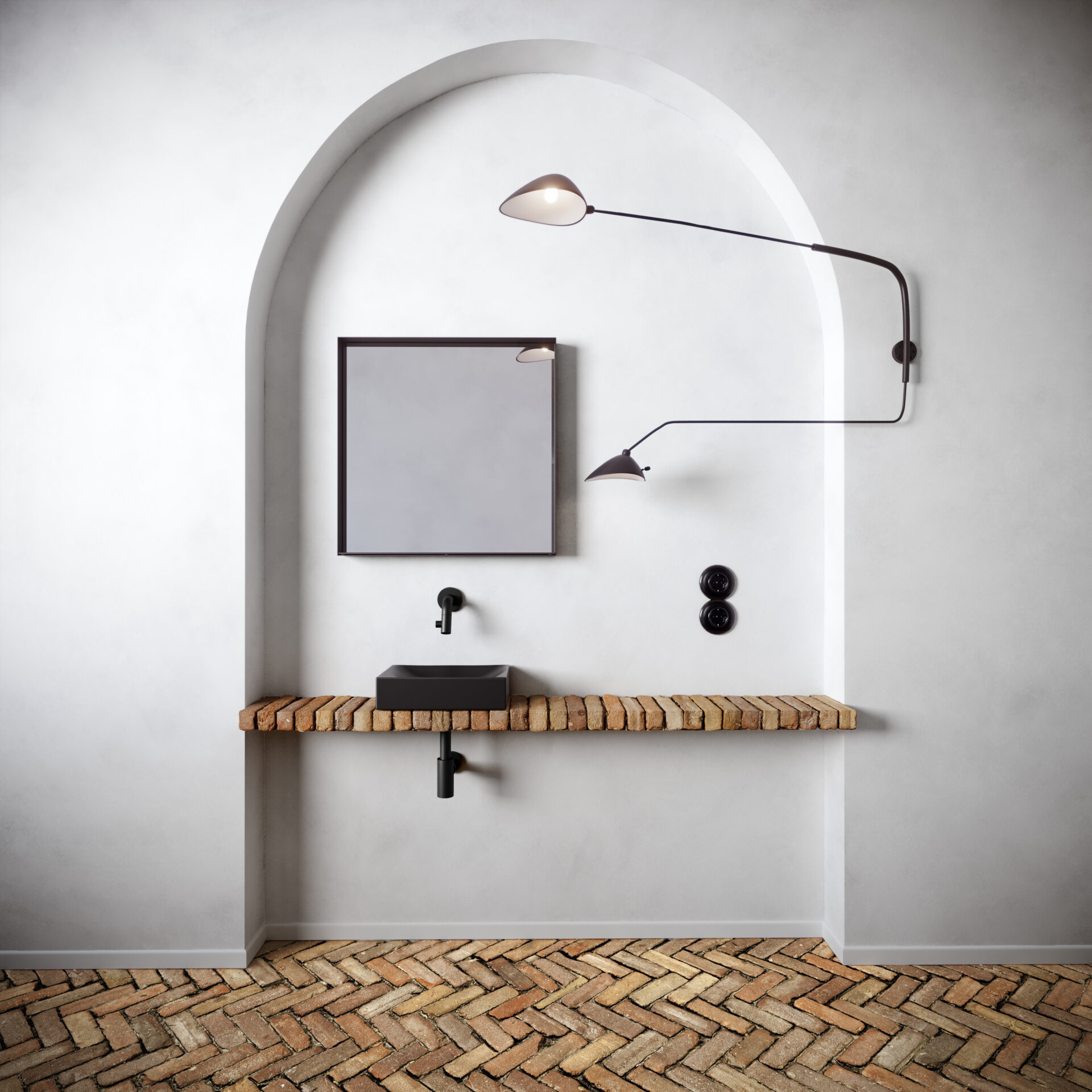
The residents have no trouble combining different shapes. Especially the cooperation of rectangular and round is popular in this house. This combination can be found almost everywhere, for example in the semicircular doors and passages. The shallow alcove in this guest toilet is also shaped according to the half-right/half-round pattern.
The residents have no trouble combining different shapes. Especially the cooperation of rectangular and round is popular in this house. This combination can be found almost everywhere, for example in the semicircular doors and passages. The shallow alcove in this guest toilet is also shaped according to the half-right/half-round pattern.
Within the alcove, it is no different: the straight Vale fountain and Look at Me mirror, despite their straight design, go perfectly with the rounder additions.
Within the alcove, it is no different: the straight Vale fountain and Look at Me mirror, despite their straight design, go perfectly with the rounder additions.
See Look at Me mirrorThe asymmetrical, adjustable lamp, a replica of Serge Mouille's 1953 design, seems to function as the middle ground between straight and round. With its straight swiveling arms and round rotating reflectors, this lamp possesses characteristics of both extremes.
The asymmetrical, adjustable lamp, a replica of Serge Mouille's 1953 design, seems to function as the middle ground between straight and round. With its straight swiveling arms and round rotating reflectors, this lamp possesses characteristics of both extremes.
View Serge Mouille two arm wall light (replica)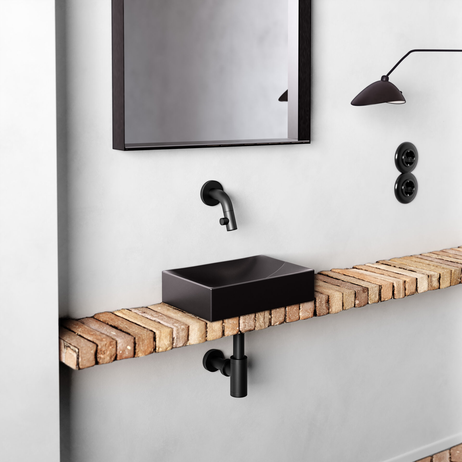
With stones removed from elsewhere, the residents made a handmade shelf in a shallow alcove. This is how modern meets old.
With stones removed from elsewhere, the residents made a handmade shelf in a shallow alcove. This is how modern meets old.
See Kaldur tapThese sockets by Thomas Hoof Produktgesellschaft mbH are made of black Bakelite, the predecessor of the thermoplastic that is often used today. The residents opted for this older material, which is heavier and more pleasing to the eye and to the touch. https://www.produktgesellschaft.de/en/switch-systems/bakelite-switch
These sockets by Thomas Hoof Produktgesellschaft mbH are made of black Bakelite, the predecessor of the thermoplastic that is often used today. The residents opted for this older material, which is heavier and more pleasing to the eye and to the touch. https://www.produktgesellschaft.de/en/switch-systems/bakelite-switch
View THPG Bakelite sockets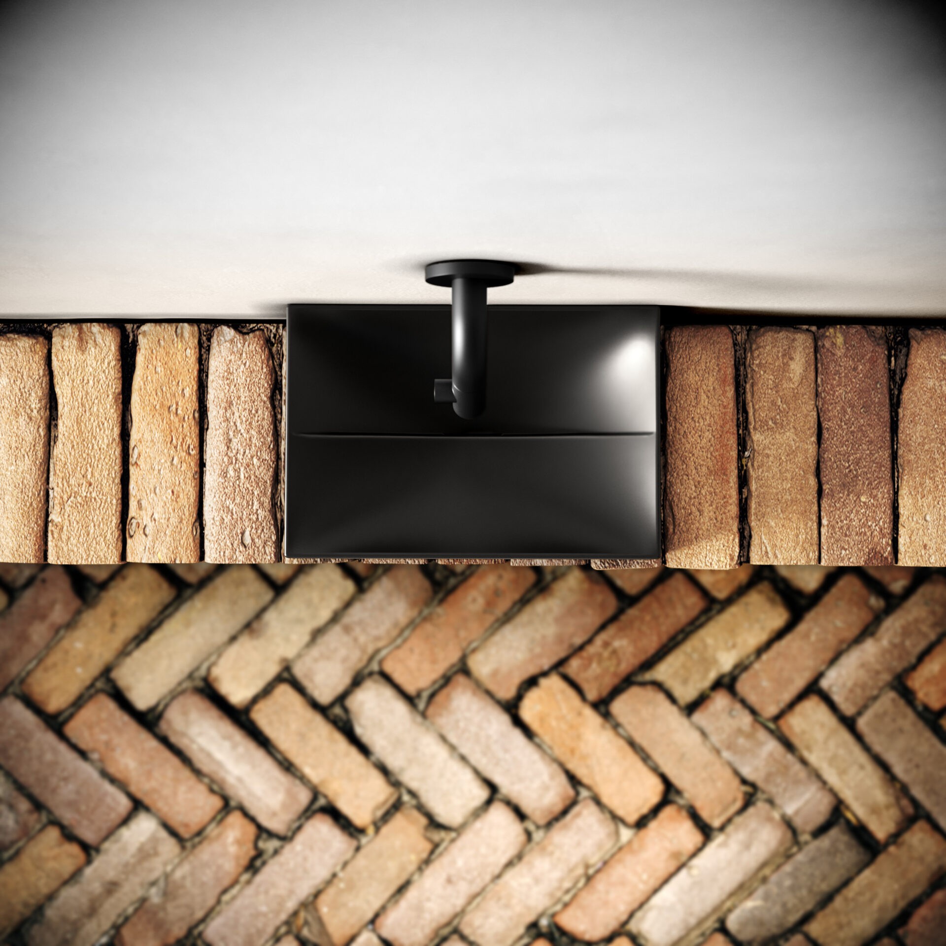
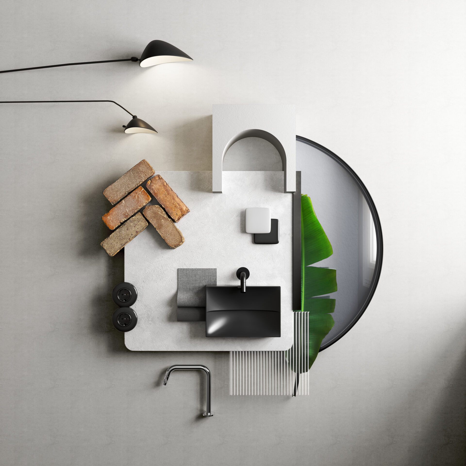
The Vale fountain, with its remarkable design and unusual drain, fits perfectly on the shelf. The straight lines of the fountain are accentuated by the weathered bricks. The different use of the bricks creates a playful whole, which, especially when viewed from above, provides a nice variation. Guests who wash their hands here have a lot to admire.
The Vale fountain, with its remarkable design and unusual drain, fits perfectly on the shelf. The straight lines of the fountain are accentuated by the weathered bricks. The different use of the bricks creates a playful whole, which, especially when viewed from above, provides a nice variation. Guests who wash their hands here have a lot to admire.
View Vale fountainOur products are available both online and offline. Find out which location is closest to you or which online option works best for you via the "points of sale" button.