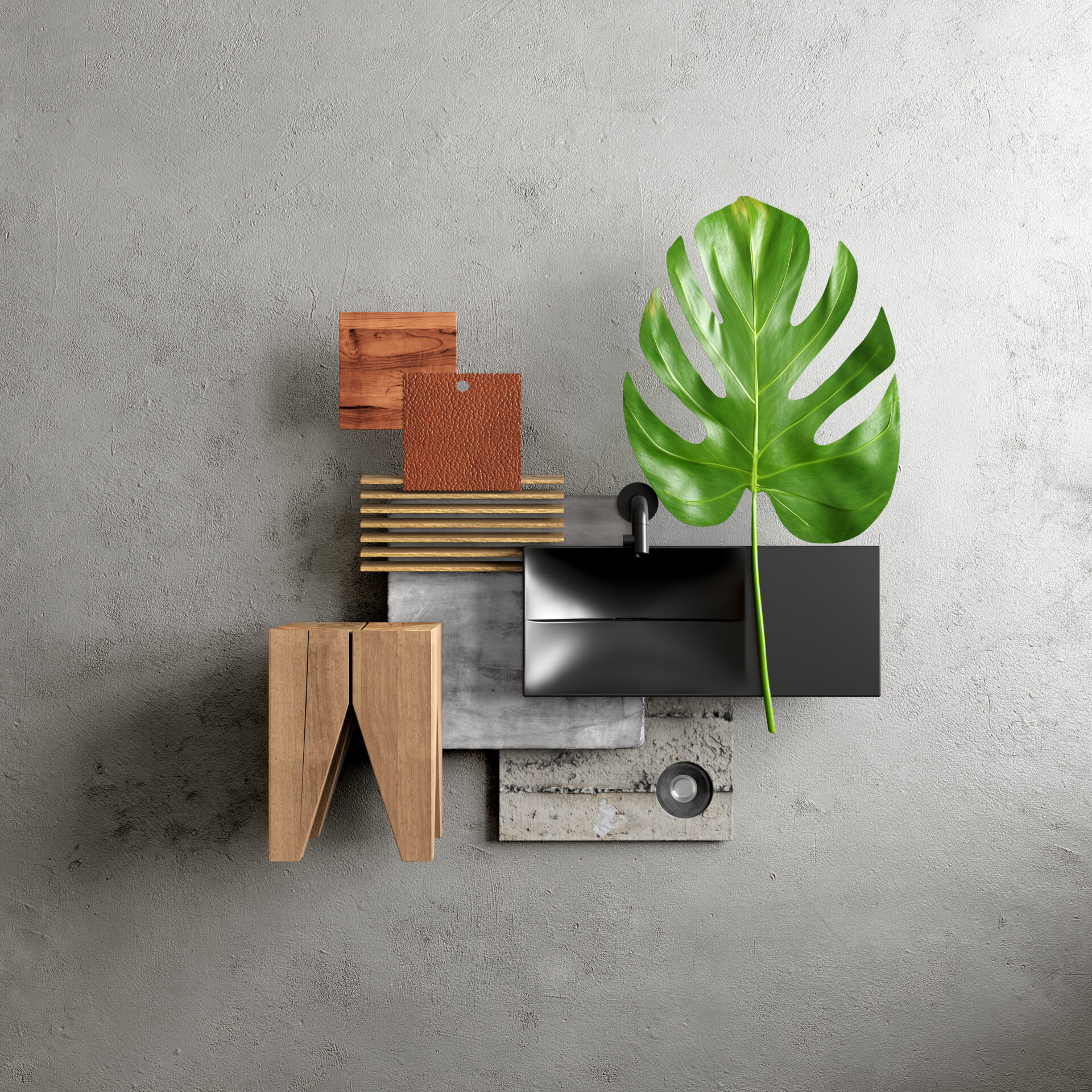
‘Grand' is the theme of this house. The mood board, however, is simple and consists of only three colour tones: grey, brown and black. The green leaf of the beautiful Monstera, also known as the Fruit Salad Plant, also counts of course. It may seem difficult to decorate an entire house with so little colour variation... so let's take a look at this impressive building to discover that simple can also be 'grand'.
‘Grand' is the theme of this house. The mood board, however, is simple and consists of only three colour tones: grey, brown and black. The green leaf of the beautiful Monstera, also known as the Fruit Salad Plant, also counts of course. It may seem difficult to decorate an entire house with so little colour variation... so let's take a look at this impressive building to discover that simple can also be 'grand'.
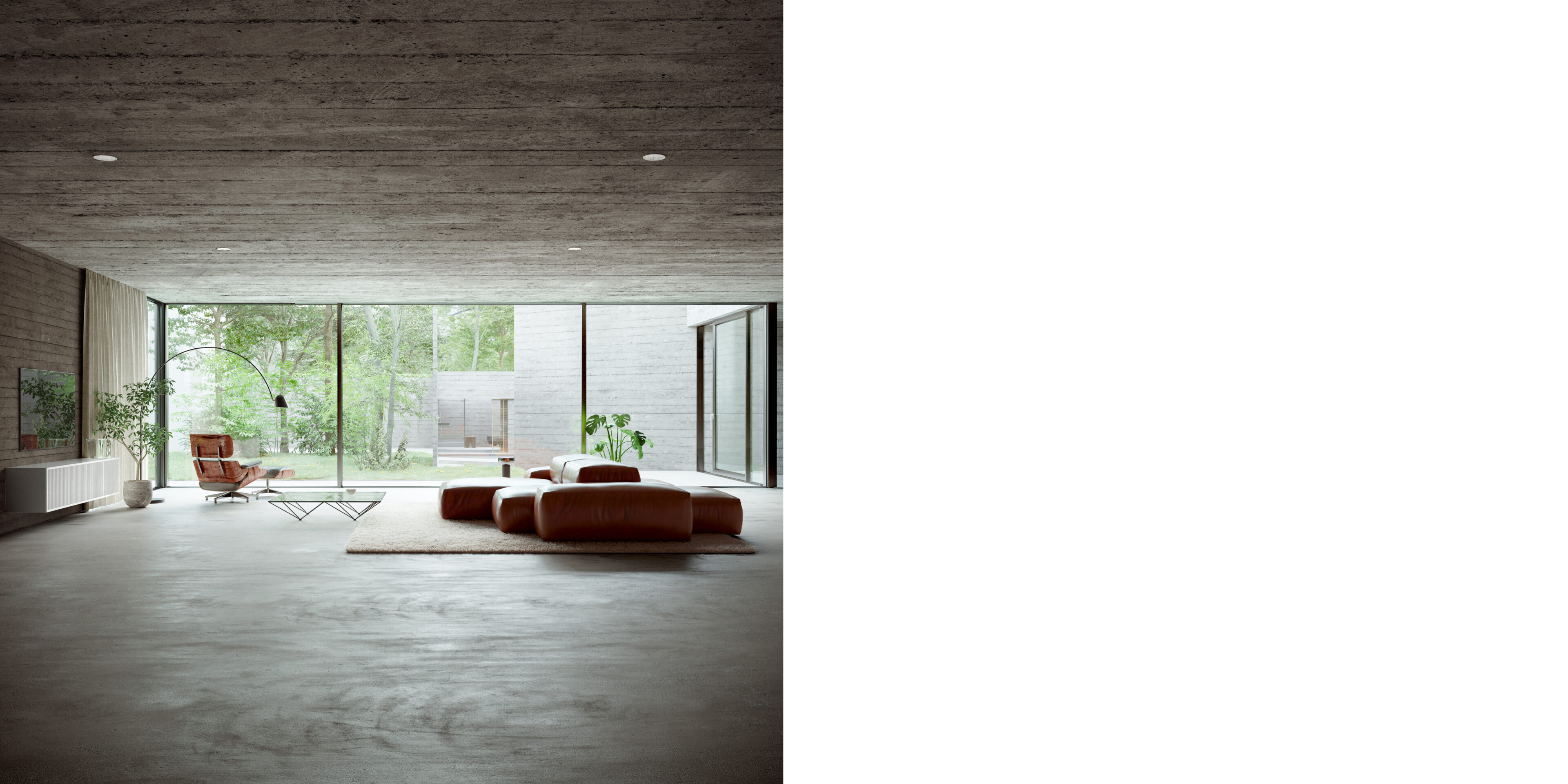
The residents have found the perfect balance in this large living room: it is not too busy and not too empty. The furniture draws attention, but does not dominate the room. The brown Extrasoft sofa designed by Piero Lissoni, with its warm brown colour and soft, playful shapes, seems to be a direct contrast to the austere, cool look of the house. And yet it works. The furniture forms a small 'living island' in the large space where the residents can see the interior on one side and enjoy the view of their garden on the other.
The residents have found the perfect balance in this large living room: it is not too busy and not too empty. The furniture draws attention, but does not dominate the room. The brown Extrasoft sofa designed by Piero Lissoni, with its warm brown colour and soft, playful shapes, seems to be a direct contrast to the austere, cool look of the house. And yet it works. The furniture forms a small 'living island' in the large space where the residents can see the interior on one side and enjoy the view of their garden on the other.
View Living Divani Extrasoft sofasThe glass Alanda coffee table designed by Paolo Piva stands out with its geometric shapes and almost futuristic design. Moreover, the low table almost seems to be a reflection of the large windows that reach from ceiling to floor.
The glass Alanda coffee table designed by Paolo Piva stands out with its geometric shapes and almost futuristic design. Moreover, the low table almost seems to be a reflection of the large windows that reach from ceiling to floor.
View B&B Italia Alanda tableIn addition to the bright green plants, the light-coloured carpet, the TV cabinet and the white plant pots subtly bring some extra colour into the room. Especially on dark days, these light, cheerful additions provide some extra variety. The residents have carefully positioned the Ray and Charles Eames-designed armchair and ottoman by Vitra. The brown seat is turned inwards and thus seamlessly matches the colour of the sofa. The brown-grey upholstery faces outwards and thus fits in perfectly with the 'organic' nature of the adjacent garden.
In addition to the bright green plants, the light-coloured carpet, the TV cabinet and the white plant pots subtly bring some extra colour into the room. Especially on dark days, these light, cheerful additions provide some extra variety. The residents have carefully positioned the Ray and Charles Eames-designed armchair and ottoman by Vitra. The brown seat is turned inwards and thus seamlessly matches the colour of the sofa. The brown-grey upholstery faces outwards and thus fits in perfectly with the 'organic' nature of the adjacent garden.
View the Vitra armchair and ottoman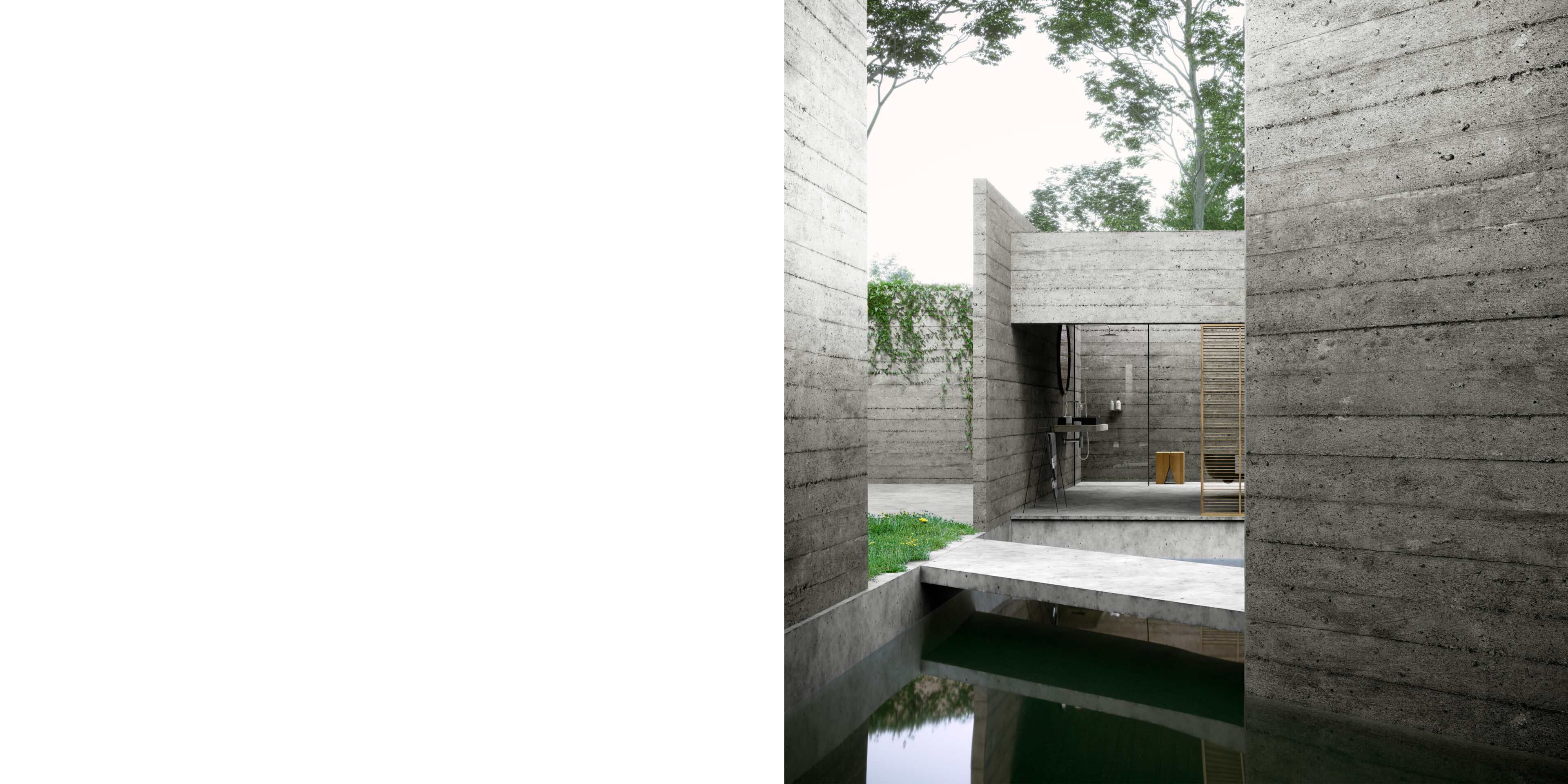
The concrete building is surrounded by a lawn, a pond that partly runs under the house, and concrete slabs along the house that serve as a footpath for the residents. Because of the asymmetrical shape of the house, the residents have a view of the garden from the living room and a part of the house, including the bathroom.
The concrete building is surrounded by a lawn, a pond that partly runs under the house, and concrete slabs along the house that serve as a footpath for the residents. Because of the asymmetrical shape of the house, the residents have a view of the garden from the living room and a part of the house, including the bathroom.
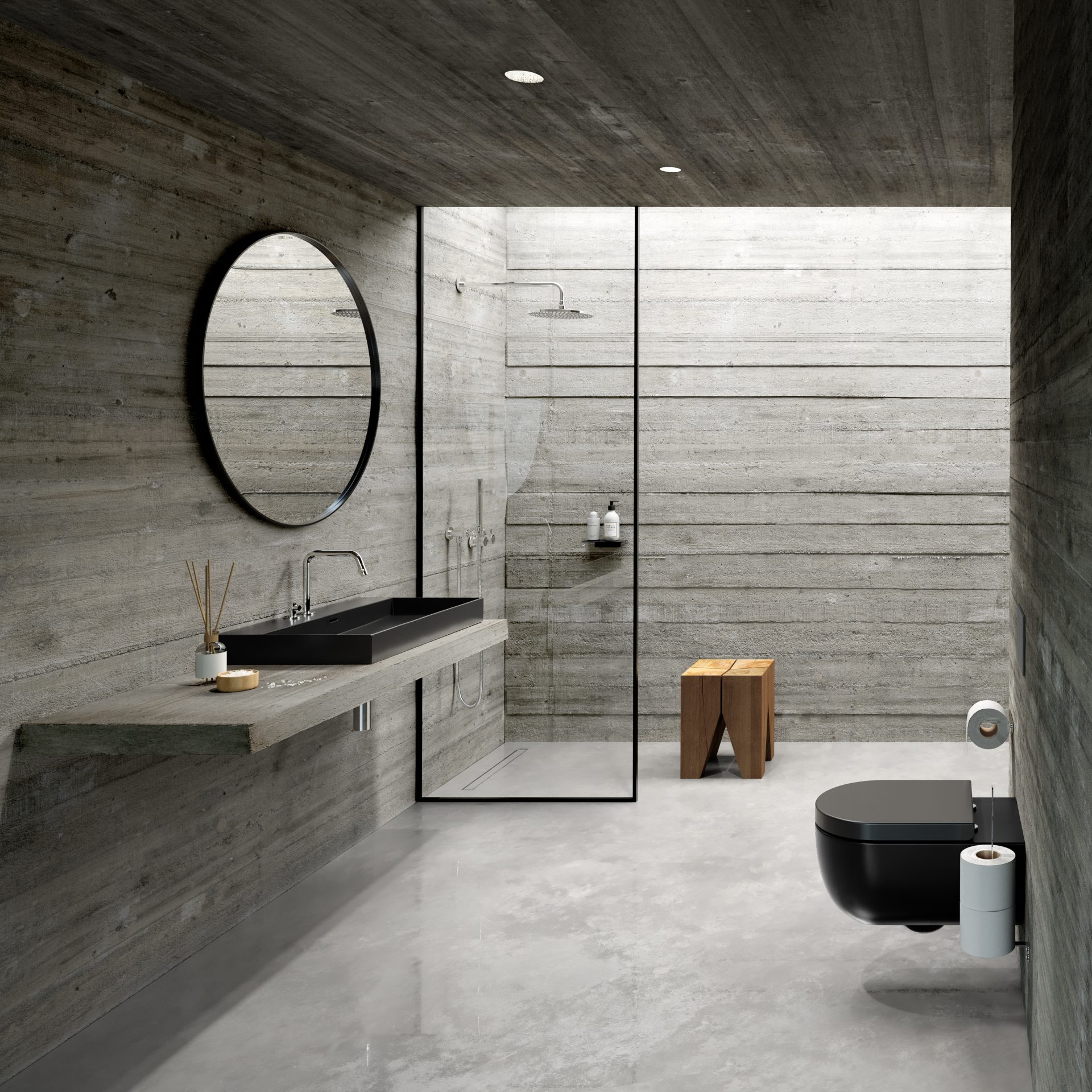
Similar to the living room styling, the residents chose a bathroom interior with few different colours. And again, the interior fits completely with the house. The residents chose a sleek, black New Wash Me washbasin and a Hammock toilet with slightly more flowing forms.
Similar to the living room styling, the residents chose a bathroom interior with few different colours. And again, the interior fits completely with the house. The residents chose a sleek, black New Wash Me washbasin and a Hammock toilet with slightly more flowing forms.
View New Wash Me and Hammock in blackThe round mirror contrasts with the rest of the interior in terms of its shape, but at the same time goes perfectly with it in terms of colour. The brown and white accessories, including the Backenzahn stool by Philipp Mainzer, add a warm touch to the room.
The round mirror contrasts with the rest of the interior in terms of its shape, but at the same time goes perfectly with it in terms of colour. The brown and white accessories, including the Backenzahn stool by Philipp Mainzer, add a warm touch to the room.
View the E15 Backenzahn stool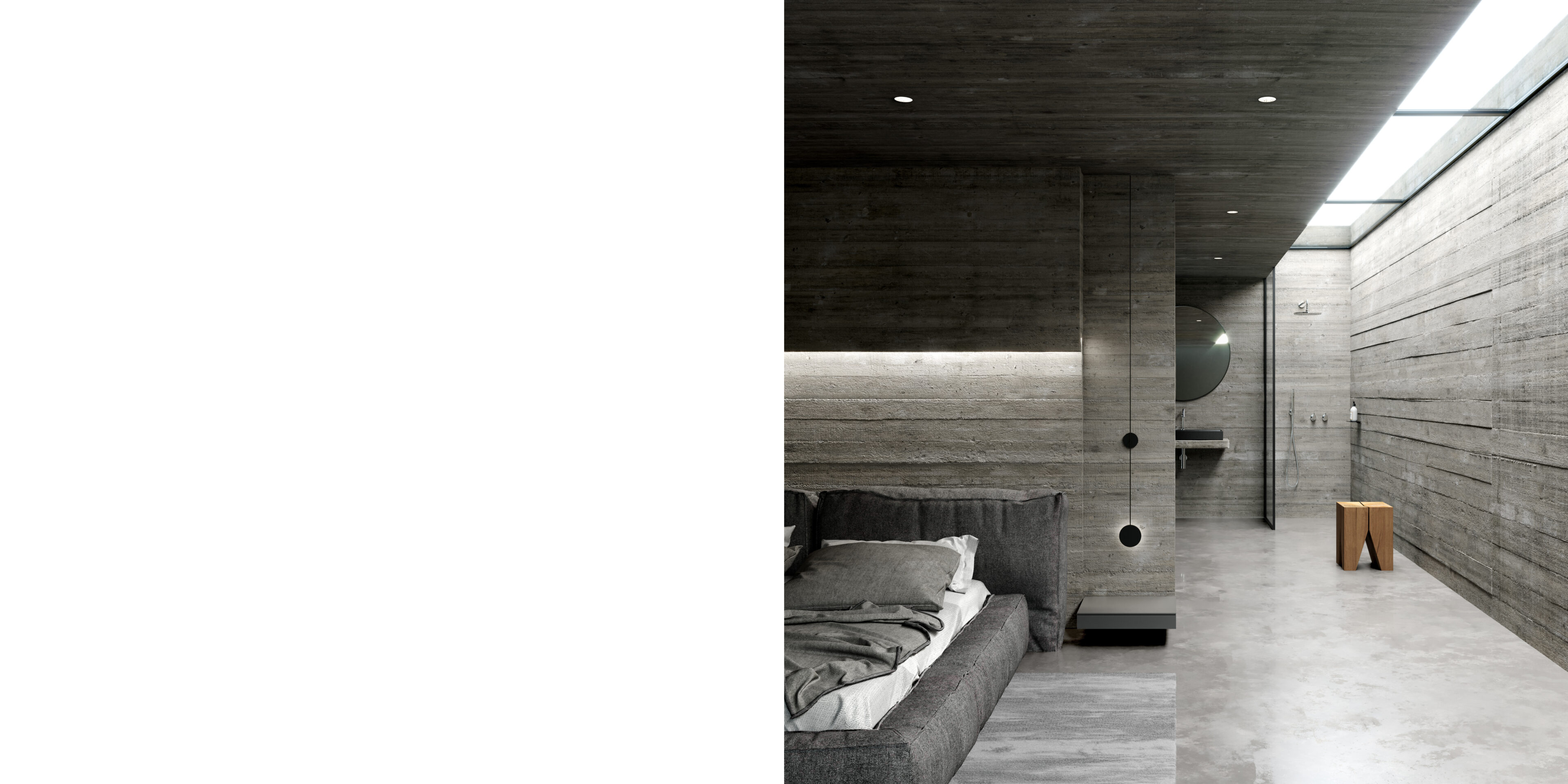
The residents have implemented the colour scheme throughout the house, including in the bedroom. Both inside and outside the walls are made of the same grey concrete. The wooden mould in which they were cast is still clearly visible, which adds a subtle structure to the walls.
The residents have implemented the colour scheme throughout the house, including in the bedroom. Both inside and outside the walls are made of the same grey concrete. The wooden mould in which they were cast is still clearly visible, which adds a subtle structure to the walls.
Especially in this room, where the walls are clearly visible, this house proves to be a paragon of modern brutalism. Everywhere we see the raw, unprocessed, 'brute' of this architectural movement that was especially popular in the 50s, 60s and 70s. Unprocessed concrete, or 'béton brut' as architect Le Corbusier called it, became a key principle of Brutalism. Concrete was poured into wooden moulds, with the edges and textures of the formwork leaving their imprints in the concrete. Consequently, the application of patterns and structures in concrete became a feature of Brutalism.
Especially in this room, where the walls are clearly visible, this house proves to be a paragon of modern brutalism. Everywhere we see the raw, unprocessed, 'brute' of this architectural movement that was especially popular in the 50s, 60s and 70s. Unprocessed concrete, or 'béton brut' as architect Le Corbusier called it, became a key principle of Brutalism. Concrete was poured into wooden moulds, with the edges and textures of the formwork leaving their imprints in the concrete. Consequently, the application of patterns and structures in concrete became a feature of Brutalism.
The furniture in the bedroom ranges from white to black, including a variety of grey tones. Next to the bed, which appears to be lying on the floor because of its soft edge, the residents have placed a low shelf and a bedside lamp. This way the furniture almost becomes part of the building and the room appears larger, both from the bed and standing next to it.
The furniture in the bedroom ranges from white to black, including a variety of grey tones. Next to the bed, which appears to be lying on the floor because of its soft edge, the residents have placed a low shelf and a bedside lamp. This way the furniture almost becomes part of the building and the room appears larger, both from the bed and standing next to it.
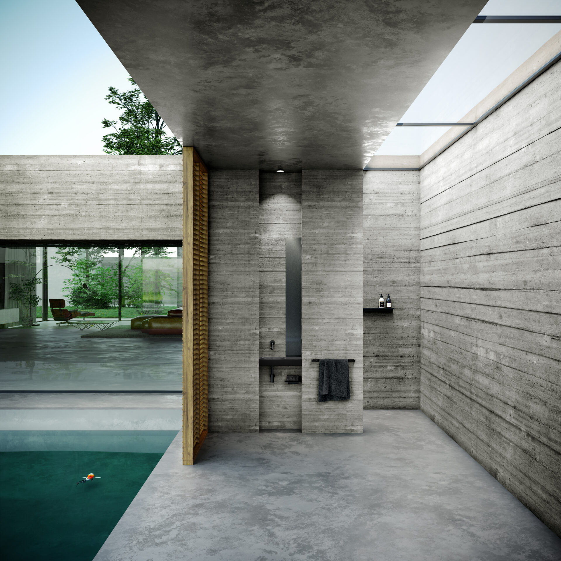
A second bathroom is located on the other side of the house, next to a large koi pond. In terms of appearance, it is almost the same as the first bathroom. Black, grey, a wooden element, a large window, a horizontal composition... but there is a big difference: this bathroom is open on one side. In this bathroom, the residents are completely one with nature. A hot shower on a winter's day? A cooling wash up after a day of working in the garden in summer? It's all possible, with nature just a few steps away.
A second bathroom is located on the other side of the house, next to a large koi pond. In terms of appearance, it is almost the same as the first bathroom. Black, grey, a wooden element, a large window, a horizontal composition... but there is a big difference: this bathroom is open on one side. In this bathroom, the residents are completely one with nature. A hot shower on a winter's day? A cooling wash up after a day of working in the garden in summer? It's all possible, with nature just a few steps away.
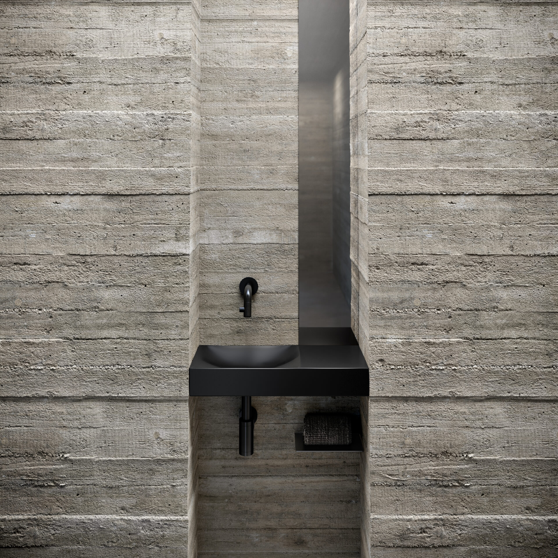
In this open bathroom, the residents have also installed a handbasin, so they do not have to go all the way inside to wash their hands. The handbasin is perfectly enclosed by the niche and is even the same height as the concrete slab in the wall. No wonder the residents chose this Vale. The vertical lines of the narrow mirror, the small towel shelf and the tap and siphon provide variety in this room, which otherwise consists of mainly horizontal lines.
In this open bathroom, the residents have also installed a handbasin, so they do not have to go all the way inside to wash their hands. The handbasin is perfectly enclosed by the niche and is even the same height as the concrete slab in the wall. No wonder the residents chose this Vale. The vertical lines of the narrow mirror, the small towel shelf and the tap and siphon provide variety in this room, which otherwise consists of mainly horizontal lines.
View Vale handbasinOur products are available both online and offline. Find out which location is closest to you or which online option works best for you via the "points of sale" button.